
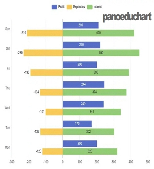
아래 코드를 복사 후 붙여넣기 한 후 엔터키(↵)를 누르세요!
var chartDom = document.getElementById('main');
var myChart = echarts.init(chartDom);
var option;123

option = {
  tooltip: {
    trigger: 'axis',
    axisPointer: {
      type: 'shadow'
    }
  },
  legend: {
    data: ['Profit', 'Expenses', 'Income']
  },
  grid: {
    left: '3%',
    right: '4%',
    bottom: '3%',
    containLabel: true
  },
  xAxis: [
    {
      type: 'value'
    }
  ],
  yAxis: [
    {
      type: 'category',
      axisTick: {
        show: false
      },
      data: ['Mon', 'Tue', 'Wed', 'Thu', 'Fri', 'Sat', 'Sun']
    }
  ],
  series: [
    {
      name: 'Profit',
      type: 'bar',
      label: {
        show: true,
        position: 'inside'
      },
      emphasis: {
        focus: 'series'
      },
      data: [200, 170, 240, 244, 200, 220, 210]
    },
    {
      name: 'Income',
      type: 'bar',
      stack: 'Total',
      label: {
        show: true
      },
      emphasis: {
        focus: 'series'
      },
      data: [320, 302, 341, 374, 390, 450, 420]
    },
    {
      name: 'Expenses',
      type: 'bar',
      stack: 'Total',
      label: {
        show: true,
        position: 'left'
      },
      emphasis: {
        focus: 'series'
      },
      data: [-120, -132, -101, -134, -190, -230, -210]
    }
  ]
};

option && myChart.setOption(option);
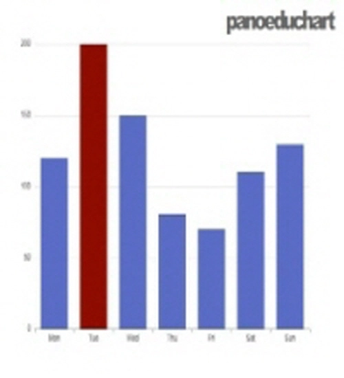
아래 코드를 복사 후 붙여넣기 한 후 엔터키(↵)를 누르세요!
var chartDom = document.getElementById('main');
var myChart = echarts.init(chartDom);
var option;

option = {
  xAxis: {
    type: 'category',
    data: ['Mon', 'Tue', 'Wed', 'Thu', 'Fri', 'Sat', 'Sun']
  },
  yAxis: {
    type: 'value'
  },
  series: [
    {
      data: [
        120,
        {
          value: 200,
          itemStyle: {
            color: '#a90000'
          }
        },
        150,
        80,
        70,
        110,
        130
      ],
      type: 'bar'
    }
  ]
};

option && myChart.setOption(option);
아래 코드를 복사 후 붙여넣기 한 후 엔터키(↵)를 누르세요!
var chartDom = document.getElementById('main');
var myChart = echarts.init(chartDom);
var option;

option = {
  dataset: [
    {
      dimensions: ['name', 'age', 'profession', 'score', 'date'],
      source: [
        ['Hannah Krause', 41, 'Engineer', 314, '2011-02-12'],
        ['Zhao Qian', 20, 'Teacher', 351, '2011-03-01'],
        ['Jasmin Krause ', 52, 'Musician', 287, '2011-02-14'],
        ['Li Lei', 37, 'Teacher', 219, '2011-02-18'],
        ['Karle Neumann', 25, 'Engineer', 253, '2011-04-02'],
        ['Adrian Groß', 19, 'Teacher', '-', '2011-01-16'],
        ['Mia Neumann', 71, 'Engineer', 165, '2011-03-19'],
        ['Böhm Fuchs', 36, 'Musician', 318, '2011-02-24'],
        ['Han Meimei', 67, 'Engineer', 366, '2011-03-12']
      ]
    },
    {
      transform: {
        type: 'sort',
        config: { dimension: 'score', order: 'desc' }
      }
    }
  ],
  xAxis: {
    type: 'category',
    axisLabel: { interval: 0, rotate: 30 }
  },
  yAxis: {},
  series: {
    type: 'bar',
    encode: { x: 'name', y: 'score' },
    datasetIndex: 1
  }
};

option && myChart.setOption(option);
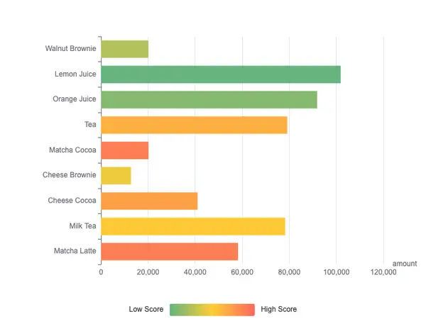
아래 코드를 복사 후 붙여넣기 한 후 엔터키(↵)를 누르세요!
var chartDom = document.getElementById('main');
var myChart = echarts.init(chartDom);
var option;

option = {
  dataset: {
    source: [
      ['score', 'amount', 'product'],
      [89.3, 58212, 'Matcha Latte'],
      [57.1, 78254, 'Milk Tea'],
      [74.4, 41032, 'Cheese Cocoa'],
      [50.1, 12755, 'Cheese Brownie'],
      [89.7, 20145, 'Matcha Cocoa'],
      [68.1, 79146, 'Tea'],
      [19.6, 91852, 'Orange Juice'],
      [10.6, 101852, 'Lemon Juice'],
      [32.7, 20112, 'Walnut Brownie']
    ]
  },
  grid: { containLabel: true },
  xAxis: { name: 'amount' },
  yAxis: { type: 'category' },
  visualMap: {
    orient: 'horizontal',
    left: 'center',
    min: 10,
    max: 100,
    text: ['High Score', 'Low Score'],
    // Map the score column to color
    dimension: 0,
    inRange: {
      color: ['#65B581', '#FFCE34', '#FD665F']
    }
  },
  series: [
    {
      type: 'bar',
      encode: {
        // Map the "amount" column to X axis.
        x: 'amount',
        // Map the "product" column to Y axis
        y: 'product'
      }
    }
  ]
};

option && myChart.setOption(option);
아래 코드를 복사 후 붙여넣기 한 후 엔터키(↵)를 누르세요!
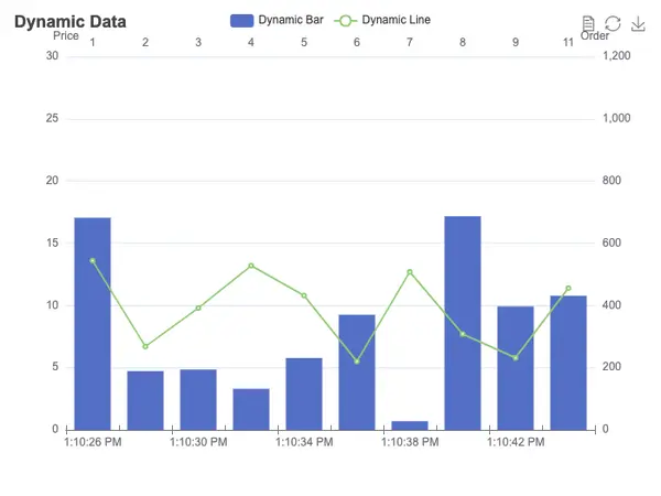
var app = {};

var chartDom = document.getElementById('main');
var myChart = echarts.init(chartDom);
var option;

const categories = (function () {
  let now = new Date();
  let res = [];
  let len = 10;
  while (len--) {
    res.unshift(now.toLocaleTimeString().replace(/^\D*/, ''));
    now = new Date(+now - 2000);
  }
  return res;
})();
const categories2 = (function () {
  let res = [];
  let len = 10;
  while (len--) {
    res.push(10 - len - 1);
  }
  return res;
})();
const data = (function () {
  let res = [];
  let len = 10;
  while (len--) {
    res.push(Math.round(Math.random() * 1000));
  }
  return res;
})();
const data2 = (function () {
  let res = [];
  let len = 0;
  while (len < 10) {
    res.push(+(Math.random() * 10 + 5).toFixed(1));
    len++;
  }
  return res;
})();
option = {
  title: {
    text: 'Dynamic Data'
  },
  tooltip: {
    trigger: 'axis',
    axisPointer: {
      type: 'cross',
      label: {
        backgroundColor: '#283b56'
      }
    }
  },
  legend: {},
  toolbox: {
    show: true,
    feature: {
      dataView: { readOnly: false },
      restore: {},
      saveAsImage: {}
    }
  },
  dataZoom: {
    show: false,
    start: 0,
    end: 100
  },
  xAxis: [
    {
      type: 'category',
      boundaryGap: true,
      data: categories
    },
    {
      type: 'category',
      boundaryGap: true,
      data: categories2
    }
  ],
  yAxis: [
    {
      type: 'value',
      scale: true,
      name: 'Price',
      max: 30,
      min: 0,
      boundaryGap: [0.2, 0.2]
    },
    {
      type: 'value',
      scale: true,
      name: 'Order',
      max: 1200,
      min: 0,
      boundaryGap: [0.2, 0.2]
    }
  ],
  series: [
    {
      name: 'Dynamic Bar',
      type: 'bar',
      xAxisIndex: 1,
      yAxisIndex: 1,
      data: data
    },
    {
      name: 'Dynamic Line',
      type: 'line',
      data: data2
    }
  ]
};
app.count = 11;
setInterval(function () {
  let axisData = new Date().toLocaleTimeString().replace(/^\D*/, '');
  data.shift();
  data.push(Math.round(Math.random() * 1000));
  data2.shift();
  data2.push(+(Math.random() * 10 + 5).toFixed(1));
  categories.shift();
  categories.push(axisData);
  categories2.shift();
  categories2.push(app.count++);
  myChart.setOption({
    xAxis: [
      {
        data: categories
      },
      {
        data: categories2
      }
    ],
    series: [
      {
        data: data
      },
      {
        data: data2
      }
    ]
  });
}, 2100);

option && myChart.setOption(option);
아래 코드를 복사 후 붙여넣기 한 후 엔터키(↵)를 누르세요!
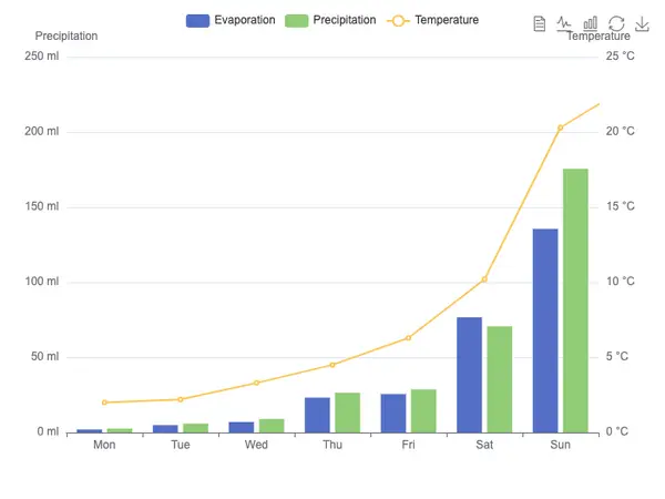
var chartDom = document.getElementById('main');
var myChart = echarts.init(chartDom);
var option;

option = {
  tooltip: {
    trigger: 'axis',
    axisPointer: {
      type: 'cross',
      crossStyle: {
        color: '#999'
      }
    }
  },
  toolbox: {
    feature: {
      dataView: { show: true, readOnly: false },
      magicType: { show: true, type: ['line', 'bar'] },
      restore: { show: true },
      saveAsImage: { show: true }
    }
  },
  legend: {
    data: ['Evaporation', 'Precipitation', 'Temperature']
  },
  xAxis: [
    {
      type: 'category',
      data: ['Mon', 'Tue', 'Wed', 'Thu', 'Fri', 'Sat', 'Sun'],
      axisPointer: {
        type: 'shadow'
      }
    }
  ],
  yAxis: [
    {
      type: 'value',
      name: 'Precipitation',
      min: 0,
      max: 250,
      interval: 50,
      axisLabel: {
        formatter: '{value} ml'
      }
    },
    {
      type: 'value',
      name: 'Temperature',
      min: 0,
      max: 25,
      interval: 5,
      axisLabel: {
        formatter: '{value} °C'
      }
    }
  ],
  series: [
    {
      name: 'Evaporation',
      type: 'bar',
      tooltip: {
        valueFormatter: function (value) {
          return value + ' ml';
        }
      },
      data: [
        2.0, 4.9, 7.0, 23.2, 25.6, 76.7, 135.6, 162.2, 32.6, 20.0, 6.4, 3.3
      ]
    },
    {
      name: 'Precipitation',
      type: 'bar',
      tooltip: {
        valueFormatter: function (value) {
          return value + ' ml';
        }
      },
      data: [
        2.6, 5.9, 9.0, 26.4, 28.7, 70.7, 175.6, 182.2, 48.7, 18.8, 6.0, 2.3
      ]
    },
    {
      name: 'Temperature',
      type: 'line',
      yAxisIndex: 1,
      tooltip: {
        valueFormatter: function (value) {
          return value + ' °C';
        }
      },
      data: [2.0, 2.2, 3.3, 4.5, 6.3, 10.2, 20.3, 23.4, 23.0, 16.5, 12.0, 6.2]
    }
  ]
};

option && myChart.setOption(option);
아래 코드를 복사 후 붙여넣기 한 후 엔터키(↵)를 누르세요!
var chartDom = document.getElementById('main');
var myChart = echarts.init(chartDom);
var option;

let xAxisData = [];
let data1 = [];
let data2 = [];
let data3 = [];
let data4 = [];
for (let i = 0; i < 10; i++) {
  xAxisData.push('Class' + i);
  data1.push(+(Math.random() * 2).toFixed(2));
  data2.push(+(Math.random() * 5).toFixed(2));
  data3.push(+(Math.random() + 0.3).toFixed(2));
  data4.push(+Math.random().toFixed(2));
}
var emphasisStyle = {
  itemStyle: {
    shadowBlur: 10,
    shadowColor: 'rgba(0,0,0,0.3)'
  }
};
option = {
  legend: {
    data: ['bar', 'bar2', 'bar3', 'bar4'],
    left: '10%'
  },
  brush: {
    toolbox: ['rect', 'polygon', 'lineX', 'lineY', 'keep', 'clear'],
    xAxisIndex: 0
  },
  toolbox: {
    feature: {
      magicType: {
        type: ['stack']
      },
      dataView: {}
    }
  },
  tooltip: {},
  xAxis: {
    data: xAxisData,
    name: 'X Axis',
    axisLine: { onZero: true },
    splitLine: { show: false },
    splitArea: { show: false }
  },
  yAxis: {},
  grid: {
    bottom: 100
  },
  series: [
    {
      name: 'bar',
      type: 'bar',
      stack: 'one',
      emphasis: emphasisStyle,
      data: data1
    },
    {
      name: 'bar2',
      type: 'bar',
      stack: 'one',
      emphasis: emphasisStyle,
      data: data2
    },
    {
      name: 'bar3',
      type: 'bar',
      stack: 'two',
      emphasis: emphasisStyle,
      data: data3
    },
    {
      name: 'bar4',
      type: 'bar',
      stack: 'two',
      emphasis: emphasisStyle,
      data: data4
    }
  ]
};
myChart.on('brushSelected', function (params) {
  var brushed = [];
  var brushComponent = params.batch[0];
  for (var sIdx = 0; sIdx < brushComponent.selected.length; sIdx++) {
    var rawIndices = brushComponent.selected[sIdx].dataIndex;
    brushed.push('[Series ' + sIdx + '] ' + rawIndices.join(', '));
  }
  myChart.setOption({
    title: {
      backgroundColor: '#333',
      text: 'SELECTED DATA INDICES: \n' + brushed.join('\n'),
      bottom: 0,
      right: '10%',
      width: 100,
      textStyle: {
        fontSize: 12,
        color: '#fff'
      }
    }
  });
});

option && myChart.setOption(option);
아래 코드를 복사 후 붙여넣기 한 후 엔터키(↵)를 누르세요!
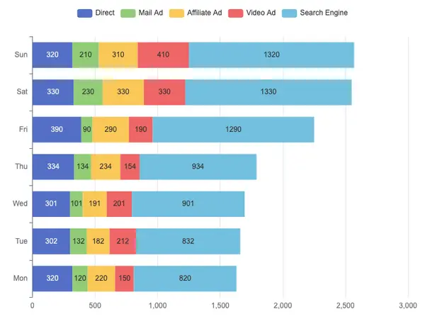
var chartDom = document.getElementById('main');
var myChart = echarts.init(chartDom);
var option;

option = {
  tooltip: {
    trigger: 'axis',
    axisPointer: {
      // Use axis to trigger tooltip
      type: 'shadow' // 'shadow' as default; can also be 'line' or 'shadow'
    }
  },
  legend: {},
  grid: {
    left: '3%',
    right: '4%',
    bottom: '3%',
    containLabel: true
  },
  xAxis: {
    type: 'value'
  },
  yAxis: {
    type: 'category',
    data: ['Mon', 'Tue', 'Wed', 'Thu', 'Fri', 'Sat', 'Sun']
  },
  series: [
    {
      name: 'Direct',
      type: 'bar',
      stack: 'total',
      label: {
        show: true
      },
      emphasis: {
        focus: 'series'
      },
      data: [320, 302, 301, 334, 390, 330, 320]
    },
    {
      name: 'Mail Ad',
      type: 'bar',
      stack: 'total',
      label: {
        show: true
      },
      emphasis: {
        focus: 'series'
      },
      data: [120, 132, 101, 134, 90, 230, 210]
    },
    {
      name: 'Affiliate Ad',
      type: 'bar',
      stack: 'total',
      label: {
        show: true
      },
      emphasis: {
        focus: 'series'
      },
      data: [220, 182, 191, 234, 290, 330, 310]
    },
    {
      name: 'Video Ad',
      type: 'bar',
      stack: 'total',
      label: {
        show: true
      },
      emphasis: {
        focus: 'series'
      },
      data: [150, 212, 201, 154, 190, 330, 410]
    },
    {
      name: 'Search Engine',
      type: 'bar',
      stack: 'total',
      label: {
        show: true
      },
      emphasis: {
        focus: 'series'
      },
      data: [820, 832, 901, 934, 1290, 1330, 1320]
    }
  ]
};

option && myChart.setOption(option);
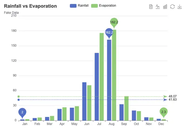
아래 코드를 복사 후 붙여넣기 한 후 엔터키(↵)를 누르세요!
var chartDom = document.getElementById('main');
var myChart = echarts.init(chartDom);
var option;

option = {
  title: {
    text: 'Rainfall vs Evaporation',
    subtext: 'Fake Data'
  },
  tooltip: {
    trigger: 'axis'
  },
  legend: {
    data: ['Rainfall', 'Evaporation']
  },
  toolbox: {
    show: true,
    feature: {
      dataView: { show: true, readOnly: false },
      magicType: { show: true, type: ['line', 'bar'] },
      restore: { show: true },
      saveAsImage: { show: true }
    }
  },
  calculable: true,
  xAxis: [
    {
      type: 'category',
      // prettier-ignore
      data: ['Jan', 'Feb', 'Mar', 'Apr', 'May', 'Jun', 'Jul', 'Aug', 'Sep', 'Oct', 'Nov', 'Dec']
    }
  ],
  yAxis: [
    {
      type: 'value'
    }
  ],
  series: [
    {
      name: 'Rainfall',
      type: 'bar',
      data: [
        2.0, 4.9, 7.0, 23.2, 25.6, 76.7, 135.6, 162.2, 32.6, 20.0, 6.4, 3.3
      ],
      markPoint: {
        data: [
          { type: 'max', name: 'Max' },
          { type: 'min', name: 'Min' }
        ]
      },
      markLine: {
        data: [{ type: 'average', name: 'Avg' }]
      }
    },
    {
      name: 'Evaporation',
      type: 'bar',
      data: [
        2.6, 5.9, 9.0, 26.4, 28.7, 70.7, 175.6, 182.2, 48.7, 18.8, 6.0, 2.3
      ],
      markPoint: {
        data: [
          { name: 'Max', value: 182.2, xAxis: 7, yAxis: 183 },
          { name: 'Min', value: 2.3, xAxis: 11, yAxis: 3 }
        ]
      },
      markLine: {
        data: [{ type: 'average', name: 'Avg' }]
      }
    }
  ]
};

option && myChart.setOption(option);
아래 코드를 복사 후 붙여넣기 한 후 엔터키(↵)를 누르세요!
var chartDom = document.getElementById('main');
var myChart = echarts.init(chartDom);
var option;

const labelRight = {
  position: 'right'
};
option = {
  title: {
    text: 'Bar Chart with Negative Value'
  },
  tooltip: {
    trigger: 'axis',
    axisPointer: {
      type: 'shadow'
    }
  },
  grid: {
    top: 80,
    bottom: 30
  },
  xAxis: {
    type: 'value',
    position: 'top',
    splitLine: {
      lineStyle: {
        type: 'dashed'
      }
    }
  },
  yAxis: {
    type: 'category',
    axisLine: { show: false },
    axisLabel: { show: false },
    axisTick: { show: false },
    splitLine: { show: false },
    data: [
      'ten',
      'nine',
      'eight',
      'seven',
      'six',
      'five',
      'four',
      'three',
      'two',
      'one'
    ]
  },
  series: [
    {
      name: 'Cost',
      type: 'bar',
      stack: 'Total',
      label: {
        show: true,
        formatter: '{b}'
      },
      data: [
        { value: -0.07, label: labelRight },
        { value: -0.09, label: labelRight },
        0.2,
        0.44,
        { value: -0.23, label: labelRight },
        0.08,
        { value: -0.17, label: labelRight },
        0.47,
        { value: -0.36, label: labelRight },
        0.18
      ]
    }
  ]
};

option && myChart.setOption(option);
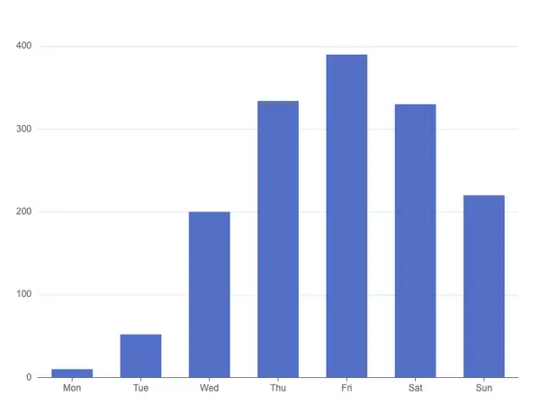
아래 코드를 복사 후 붙여넣기 한 후 엔터키(↵)를 누르세요!
var chartDom = document.getElementById('main');
var myChart = echarts.init(chartDom);
var option;

option = {
  tooltip: {
    trigger: 'axis',
    axisPointer: {
      type: 'shadow'
    }
  },
  grid: {
    left: '3%',
    right: '4%',
    bottom: '3%',
    containLabel: true
  },
  xAxis: [
    {
      type: 'category',
      data: ['Mon', 'Tue', 'Wed', 'Thu', 'Fri', 'Sat', 'Sun'],
      axisTick: {
        alignWithLabel: true
      }
    }
  ],
  yAxis: [
    {
      type: 'value'
    }
  ],
  series: [
    {
      name: 'Direct',
      type: 'bar',
      barWidth: '60%',
      data: [10, 52, 200, 334, 390, 330, 220]
    }
  ]
};

option && myChart.setOption(option);
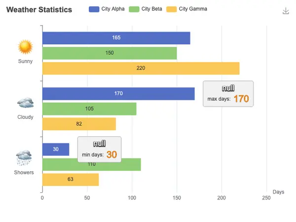
아래 코드를 복사 후 붙여넣기 한 후 엔터키(↵)를 누르세요!
var ROOT_PATH = 'https://echarts.apache.org/examples';

var chartDom = document.getElementById('main');
var myChart = echarts.init(chartDom);
var option;

const weatherIcons = {
  Sunny: ROOT_PATH + '/data/asset/img/weather/sunny_128.png',
  Cloudy: ROOT_PATH + '/data/asset/img/weather/cloudy_128.png',
  Showers: ROOT_PATH + '/data/asset/img/weather/showers_128.png'
};
const seriesLabel = {
  show: true
};
option = {
  title: {
    text: 'Weather Statistics'
  },
  tooltip: {
    trigger: 'axis',
    axisPointer: {
      type: 'shadow'
    }
  },
  legend: {
    data: ['City Alpha', 'City Beta', 'City Gamma']
  },
  grid: {
    left: 100
  },
  toolbox: {
    show: true,
    feature: {
      saveAsImage: {}
    }
  },
  xAxis: {
    type: 'value',
    name: 'Days',
    axisLabel: {
      formatter: '{value}'
    }
  },
  yAxis: {
    type: 'category',
    inverse: true,
    data: ['Sunny', 'Cloudy', 'Showers'],
    axisLabel: {
      formatter: function (value) {
        return '{' + value + '| }\n{value|' + value + '}';
      },
      margin: 20,
      rich: {
        value: {
          lineHeight: 30,
          align: 'center'
        },
        Sunny: {
          height: 40,
          align: 'center',
          backgroundColor: {
            image: weatherIcons.Sunny
          }
        },
        Cloudy: {
          height: 40,
          align: 'center',
          backgroundColor: {
            image: weatherIcons.Cloudy
          }
        },
        Showers: {
          height: 40,
          align: 'center',
          backgroundColor: {
            image: weatherIcons.Showers
          }
        }
      }
    }
  },
  series: [
    {
      name: 'City Alpha',
      type: 'bar',
      data: [165, 170, 30],
      label: seriesLabel,
      markPoint: {
        symbolSize: 1,
        symbolOffset: [0, '50%'],
        label: {
          formatter: '{a|{a}\n}{b|{b} }{c|{c}}',
          backgroundColor: 'rgb(242,242,242)',
          borderColor: '#aaa',
          borderWidth: 1,
          borderRadius: 4,
          padding: [4, 10],
          lineHeight: 26,
          // shadowBlur: 5,
          // shadowColor: '#000',
          // shadowOffsetX: 0,
          // shadowOffsetY: 1,
          position: 'right',
          distance: 20,
          rich: {
            a: {
              align: 'center',
              color: '#fff',
              fontSize: 18,
              textShadowBlur: 2,
              textShadowColor: '#000',
              textShadowOffsetX: 0,
              textShadowOffsetY: 1,
              textBorderColor: '#333',
              textBorderWidth: 2
            },
            b: {
              color: '#333'
            },
            c: {
              color: '#ff8811',
              textBorderColor: '#000',
              textBorderWidth: 1,
              fontSize: 22
            }
          }
        },
        data: [
          { type: 'max', name: 'max days: ' },
          { type: 'min', name: 'min days: ' }
        ]
      }
    },
    {
      name: 'City Beta',
      type: 'bar',
      label: seriesLabel,
      data: [150, 105, 110]
    },
    {
      name: 'City Gamma',
      type: 'bar',
      label: seriesLabel,
      data: [220, 82, 63]
    }
  ]
};

option && myChart.setOption(option);
아래 코드를 복사 후 붙여넣기 한 후 엔터키(↵)를 누르세요!
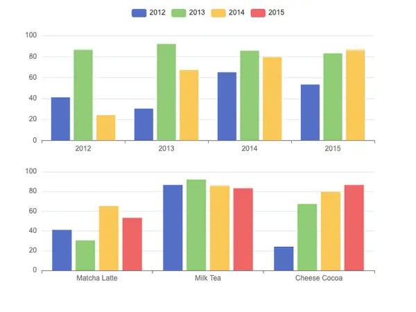
var chartDom = document.getElementById('main');
var myChart = echarts.init(chartDom);
var option;

option = {
  legend: {},
  tooltip: {},
  dataset: {
    source: [
      ['product', '2012', '2013', '2014', '2015'],
      ['Matcha Latte', 41.1, 30.4, 65.1, 53.3],
      ['Milk Tea', 86.5, 92.1, 85.7, 83.1],
      ['Cheese Cocoa', 24.1, 67.2, 79.5, 86.4]
    ]
  },
  xAxis: [
    { type: 'category', gridIndex: 0 },
    { type: 'category', gridIndex: 1 }
  ],
  yAxis: [{ gridIndex: 0 }, { gridIndex: 1 }],
  grid: [{ bottom: '55%' }, { top: '55%' }],
  series: [
    // These series are in the first grid.
    { type: 'bar', seriesLayoutBy: 'row' },
    { type: 'bar', seriesLayoutBy: 'row' },
    { type: 'bar', seriesLayoutBy: 'row' },
    // These series are in the second grid.
    { type: 'bar', xAxisIndex: 1, yAxisIndex: 1 },
    { type: 'bar', xAxisIndex: 1, yAxisIndex: 1 },
    { type: 'bar', xAxisIndex: 1, yAxisIndex: 1 },
    { type: 'bar', xAxisIndex: 1, yAxisIndex: 1 }
  ]
};

option && myChart.setOption(option);
아래 코드를 복사 후 붙여넣기 한 후 엔터키(↵)를 누르세요!
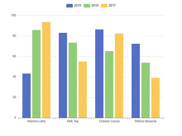
var app = {};

var chartDom = document.getElementById('main');
var myChart = echarts.init(chartDom);
var option;

option = {
  legend: {},
  tooltip: {},
  dataset: {
    dimensions: ['product', '2020', '2021', '2022'],
    source: [
      { product: 'Matcha Latte', 2020: 43.3, 2021: 85.8, 2022: 93.7 },
      { product: 'Milk Tea', 2020: 83.1, 2021: 73.4, 2022: 55.1 },
      { product: 'Cheese Cocoa', 2020: 86.4, 2021: 65.2, 2022: 82.5 },
      { product: 'Walnut Brownie', 2020: 72.4, 2021: 53.9, 2022: 39.1 }
    ]
  },
  xAxis: { type: 'category' },
  yAxis: {},
  // Declare several bar series, each will be mapped
  // to a column of dataset.source by default.
  series: [{ type: 'bar' }, { type: 'bar' }, { type: 'bar' }]
};

option && myChart.setOption(option);
아래 코드를 복사 후 붙여넣기 한 후 엔터키(↵)를 누르세요!
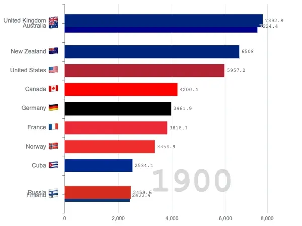
var ROOT_PATH = 'https://echarts.apache.org/examples';

var chartDom = document.getElementById('main');
var myChart = echarts.init(chartDom);
var option;

const updateFrequency = 2000;
const dimension = 0;
const countryColors = {
  Australia: '#00008b',
  Canada: '#f00',
  China: '#ffde00',
  Cuba: '#002a8f',
  Finland: '#003580',
  France: '#ed2939',
  Germany: '#000',
  Iceland: '#003897',
  India: '#f93',
  Japan: '#bc002d',
  'North Korea': '#024fa2',
  'South Korea': '#000',
  'New Zealand': '#00247d',
  Norway: '#ef2b2d',
  Poland: '#dc143c',
  Russia: '#d52b1e',
  Turkey: '#e30a17',
  'United Kingdom': '#00247d',
  'United States': '#b22234'
};
$.when(
  $.getJSON('https://fastly.jsdelivr.net/npm/emoji-flags@1.3.0/data.json'),
  $.getJSON(ROOT_PATH + '/data/asset/data/life-expectancy-table.json')
).done(function (res0, res1) {
  const flags = res0[0];
  const data = res1[0];
  const years = [];
  for (let i = 0; i < data.length; ++i) {
    if (years.length === 0 || years[years.length - 1] !== data[i][4]) {
      years.push(data[i][4]);
    }
  }
  function getFlag(countryName) {
    if (!countryName) {
      return '';
    }
    return (
      flags.find(function (item) {
        return item.name === countryName;
      }) || {}
    ).emoji;
  }
  let startIndex = 10;
  let startYear = years[startIndex];
  option = {
    grid: {
      top: 10,
      bottom: 30,
      left: 150,
      right: 80
    },
    xAxis: {
      max: 'dataMax',
      axisLabel: {
        formatter: function (n) {
          return Math.round(n) + '';
        }
      }
    },
    dataset: {
      source: data.slice(1).filter(function (d) {
        return d[4] === startYear;
      })
    },
    yAxis: {
      type: 'category',
      inverse: true,
      max: 10,
      axisLabel: {
        show: true,
        fontSize: 14,
        formatter: function (value) {
          return value + '{flag|' + getFlag(value) + '}';
        },
        rich: {
          flag: {
            fontSize: 25,
            padding: 5
          }
        }
      },
      animationDuration: 300,
      animationDurationUpdate: 300
    },
    series: [
      {
        realtimeSort: true,
        seriesLayoutBy: 'column',
        type: 'bar',
        itemStyle: {
          color: function (param) {
            return countryColors[param.value[3]] || '#5470c6';
          }
        },
        encode: {
          x: dimension,
          y: 3
        },
        label: {
          show: true,
          precision: 1,
          position: 'right',
          valueAnimation: true,
          fontFamily: 'monospace'
        }
      }
    ],
    // Disable init animation.
    animationDuration: 0,
    animationDurationUpdate: updateFrequency,
    animationEasing: 'linear',
    animationEasingUpdate: 'linear',
    graphic: {
      elements: [
        {
          type: 'text',
          right: 160,
          bottom: 60,
          style: {
            text: startYear,
            font: 'bolder 80px monospace',
            fill: 'rgba(100, 100, 100, 0.25)'
          },
          z: 100
        }
      ]
    }
  };
  // console.log(option);
  myChart.setOption(option);
  for (let i = startIndex; i < years.length - 1; ++i) {
    (function (i) {
      setTimeout(function () {
        updateYear(years[i + 1]);
      }, (i - startIndex) * updateFrequency);
    })(i);
  }
  function updateYear(year) {
    let source = data.slice(1).filter(function (d) {
      return d[4] === year;
    });
    option.series[0].data = source;
    option.graphic.elements[0].style.text = year;
    myChart.setOption(option);
  }
});

option && myChart.setOption(option);
아래 코드를 복사 후 붙여넣기 한 후 엔터키(↵)를 누르세요!
var chartDom = document.getElementById('main');
var myChart = echarts.init(chartDom);
var option;

option = {
  tooltip: {
    trigger: 'item'
  },
  legend: {
    top: '5%',
    left: 'center',
    // doesn't perfectly work with our tricks, disable it
    selectedMode: false
  },
  series: [
    {
      name: 'Access From',
      type: 'pie',
      radius: ['40%', '70%'],
      center: ['50%', '70%'],
      // adjust the start angle
      startAngle: 180,
      label: {
        show: true,
        formatter(param) {
          // correct the percentage
          return param.name + ' (' + param.percent * 2 + '%)';
        }
      },
      data: [
        { value: 1048, name: 'Search Engine' },
        { value: 735, name: 'Direct' },
        { value: 580, name: 'Email' },
        { value: 484, name: 'Union Ads' },
        { value: 300, name: 'Video Ads' },
        {
          // make an record to fill the bottom 50%
          value: 1048 + 735 + 580 + 484 + 300,
          itemStyle: {
            // stop the chart from rendering this piece
            color: 'none',
            decal: {
              symbol: 'none'
            }
          },
          label: {
            show: false
          }
        }
      ]
    }
  ]
};

option && myChart.setOption(option);
아래 코드를 복사 후 붙여넣기 한 후 엔터키(↵)를 누르세요!
var chartDom = document.getElementById('main');
var myChart = echarts.init(chartDom);
var option;

option = {
  dataset: [
    {
      dimensions: ['name', 'age', 'profession', 'score', 'date'],
      source: [
        ['Hannah Krause', 41, 'Engineer', 314, '2011-02-12'],
        ['Zhao Qian', 20, 'Teacher', 351, '2011-03-01'],
        ['Jasmin Krause ', 52, 'Musician', 287, '2011-02-14'],
        ['Li Lei', 37, 'Teacher', 219, '2011-02-18'],
        ['Karle Neumann', 25, 'Engineer', 253, '2011-04-02'],
        ['Adrian Groß', 19, 'Teacher', '-', '2011-01-16'],
        ['Mia Neumann', 71, 'Engineer', 165, '2011-03-19'],
        ['Böhm Fuchs', 36, 'Musician', 318, '2011-02-24'],
        ['Han Meimei', 67, 'Engineer', 366, '2011-03-12']
      ]
    },
    {
      transform: {
        type: 'sort',
        config: { dimension: 'score', order: 'desc' }
      }
    }
  ],
  xAxis: {
    type: 'category',
    axisLabel: { interval: 0, rotate: 30 }
  },
  yAxis: {},
  series: {
    type: 'bar',
    encode: { x: 'name', y: 'score' },
    datasetIndex: 1
  }
};

option && myChart.setOption(option);